So many things can make packaging successful: colour, design, shape, function, brand history (the list can go on!). One of them makes for something interesting, two makes for something memorable—but all of them together at once? That makes for iconic packaging. And that’s what Johnnie Walker achieved with their brand-defining bottle.
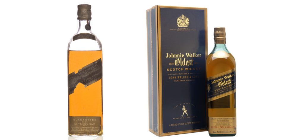
Original Johnnie Walker Bottle
The signature square-walled bottle was introduced in 1860. Designed to fit more bottles into the same space while reducing the likelihood of breakage, its unique design is one half of why Johnnie Walker has earned a place in our hall of iconic packaging.
The other half has to do with the unique design and application of its gorgeous blue-and-gold label. Angled 24 degrees upward from left to right, the orientation of the label allows for the text to be made larger and easier to see at a distance. Together, the label, bottle and amber liquid inside are instantly recognizable when sitting on a shelf. It’s no wonder it’s the world’s best-selling Scotch whisky.
In the picture above, on the left you’ll see one of the original Johnnie Walker bottles and its memorable design. On the right, you’ll see the Johnnie Walker Oldest blend, which features whiskies aged from 15 to 60 years. It’s easy to see how even as the brand has grown and moved forward, it’s kept the design sensibilities and sense of style that made it stand out in the first place.
Johnnie Walker Colour Labels

Throughout the company’s history, Johnnie Walker has debuted new product lines as their whiskies have changed and aged. Today that lineup consists of seven whiskies, each named after the colour of their label and featuring a unique take on the original square-walled bottle, while still retaining the look and feel that makes Johnnie Walker instantly recognizable.
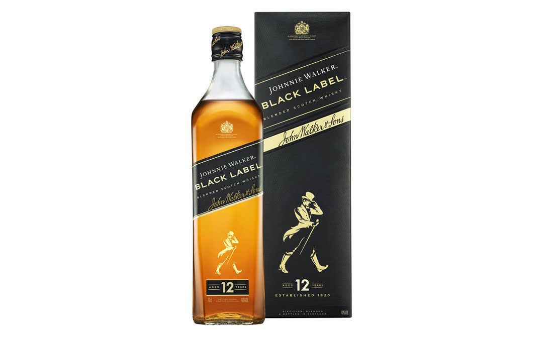
Red Label debuted in 1906 under the name Special Old Highland and has been the best-selling Scotch whisky in the world since 1945. Primarily used in mixed drinks, it features the simplest iteration of the iconic bottle—allowing the amber colour of the whisky and the red in the label to complement each other while still standing out on the shelves. Black Label debuted in 1865 under the name Walker’s Old Highland, before being renamed to Extra Special Old Highland in 1906, and finally to its current name in 1906. Aged 12 years and nearly as popular as Red Label, it possesses a dark amber colour and is housed in a suitably darker, more angular bottle.
Double Black Label launched in 2011 as a travel-specific blend of Johnnie Walker before being brought to mass market later in the year. Beginning life as a Black Label blend, whisky made from peat malt is added into the mix and the new whisky is matured in heavily charred old oak casks. Recognizing its roots, its bottle features darker glass and more rounded edges than its Black Label sibling.
Green Label was first introduced in 1997 as Johnnie Walker Pure Malt 15 Year Old, before being renamed to Johnnie Walker Green Label in 2004. It’s a blended malt whisky, meaning it contains no grain whisky and is made only from single malt blends (each a minimum of 15 years old). Briefly leaving global availability in 2012 (except for Taiwan), demand saw it brought back in 2016. Its bottle design prominently displays its blend age while featuring a heavier bottle base than its siblings.
Gold Label Reserve launched in 1997 as The Centenary Blend before settling on its new name in 2013. Featuring a blend of over 15 single malts, it commemorates Johnnie Walker’s centenary. Much like Green Label, it has a heavier bottle base than earlier blends while opting for sharper lines.
Platinum Label arrived in 2011, introduced to sell alongside Gold Label Reserve. In mid-2017, the colour-based name was retired and changed to Aged 18 Years. Its bottle features an increased height and much more dramatic lines, especially near its base.
Blue Label is Johnnie Walker’s premium blend. Introduced in 1992, it recreates the character and taste of the earliest blends created in the late 1800s. Part of Blue Label’s appeal is its exclusivity, as bottles are numbered serially, packed in a silk-lined box along with a certificate of authenticity. It’s among the most expensive blended Scotch whiskies on the market, with prices reaching nearly $500 USD for some bottles. In the picture above, you can see how its glass possesses a blue hue, and its label design feels very much like the original Johnnie Walker Bottle.
Johnnie Walker Swing Bottle

If things that don’t bend, break—then things that don’t rock, topple (and then also break).
Johnnie Walker whisky found itself in the fortunate (and lucrative) position of being in high demand by sailors and passengers on long transatlantic voyages. But, as boats are subject to the whims of the sea, rough waves were a significant threat to a barman’s stash. And even with the use of anchored racks, bottles were constantly in danger of cracking and colliding during stormy weather.
Setting out to create something that could better withstand pitch and roll, Johnnie Walker succeeded in 1932 with the debut of the Johnnie Walker Swing bottle. Moving away from its square-walled profile, it took on an appearance more commonly seen in a rum bottle. Its wider shape helped to lower its center of gravy for more stability, but what really made it stand out was its rounded, irregular bottom.
That feature allowed it to rock back and forth, better handling the motion of a ship at sea. And soon, people were so enthralled and impressed by the bottle that it would often be displayed prominently on bar tops and the desks of ship captains. Eye-catching, memorable and featuring quite the unique whisky blend (comprising up to 35 whiskies and favouring malts from Speyside in the Scottish Highlands), the Swing bottle was another hit for Johnnie Walker.
Game of Thrones Bottles
One’s a world-famous whisky. The other’s a world-famous fantasy drama. And while putting them together is a bit unexpected, it certainly works—especially when it comes to the whole “Walker” thing.

Celebrating the end of Game of Thrones’ run on TV, 3 special edition whisky collections were released across 2018 and 2019. The first, White Walker by Johnnie Walker, features the Striding Man decked out in the armour of the Night King. Wrapped in an icy, wintry texture, the bottle reveals an excellent surprise once placed in the freezer.
Thanks to the use of thermochromic ink, glowing blue cracks appear on the bottle, along with the wording “Winter is Here” down its side. And in the bottle’s most chilling and awesome touch, the eyes of the Striding Man turn blue, giving him the haunting and other-worldly stare of the White Walkers and their undead army of wights.

The second release, The Game of Thrones Single Malt Scotch Whisky Collection, comprises eight blends—representing seven of the nine Great Houses of Westeros (excluding Houses Arryn and Martell) along with the military order, the Night’s Watch. The bottles of the Great Houses, branded with their individual sigils, are clear and round-walled, while the Night’s Watch bottle is brooding and black, mirroring the brotherhood’s disposition and their dark and fur-heavy choice of attire.
Each bottle is housed in its own capped and printed round tube. Once again featuring the house sigils (alongside gold seals proudly displaying the Great House’s whisky blend), the collection has proven to be highly coveted among collectors and whisky connoisseurs.

The final release, The Song of Ice and Fire Collection, honours two of the show’s most important houses. A Song of Ice represents House Stark and Jon Snow, former Lord Commander of the Night’s Watch, one-time King in the North, and winner of the Battle of the Bastards. The bottle design features the snowy imagery of the North, along with a depiction of a direwolf—oversized and loyal wolves that once protected the Stark family children (a direwolf is also the Stark family sigil). The design itself also takes advantage of the bottle’s surface area by wrapping around it, creating the multi-vessel canvas you see in the picture and building interest for collectors. Very smart.
As the collection’s complementary bottle, A Song of Fire represents House Targaryen and Daenerys Stormborn, First of Her Name, Queen of the Andals and the First Men, Protector of the Seven Kingdoms, the Mother of Dragons, Khaleesi of the Great Grass Sea, the Unburnt, Queen of Meereen, and the Breaker of Chains (we just had to say it!). This bottle features the red skies of Valyria (home of the Targaryens) along with a depiction of Drogon, Daenerys’ largest dragon (a dragon is also the Targaryen family sigil). Much like the first bottle, it also features a wrap-around design. But, in an interesting turn, the Striding Man appears backwards on the bottle, suggesting a potential battle between both houses.
It’s impressive how square-walls and angled labels helped create such an iconic look for Johnnie Walker and its whisky. Walking among shelves and shelves of competing brands, its packaging never fails to stand out, catch you eye, and hold your attention. What packaging do you think is worthy of the iconic packaging mantle? Share your thoughts with us and we might just showcase it in this iconic series.