Done well, packaging can be eye-catching and all-consuming. It’s so easy to get lost and start aimlessly wandering the aisles, looking at beautiful and unique packaging design. It’s no different when it comes to the concepting, bottling and packaging of alcohol. Some creations are so well-known, and so recognizable, that they move into the realm of iconic packaging. With its willingness to play around with label design, bottle shape and even its own recipe, Jameson Whiskey deserves iconic status.
John Jameson and Son Irish Whiskey formed in 1810, when John and his son (also John) took control of the Bow Street Distillery in Dublin, Ireland. Today, Jameson Irish Whiskey is the world’s third largest single-distillery whiskey brand.
St. Patrick’s Day Limited Editions
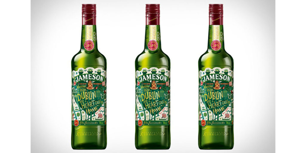
One of Jameson’s newest product lines, the St. Patrick’s Day Limited Edition bottle was first released in 2012 and has now become an annual release. For every iteration, a new artist is tasked with creating a label design that reflects something about Ireland. The design pictured here celebrates Dublin and its heritage, while past versions include a silver bottle with stylized shamrocks, and a design inspired by the Fianna, Irish warriors know for valuing loyalty, comradery and bravery.
Jameson Whiskey Caskmates
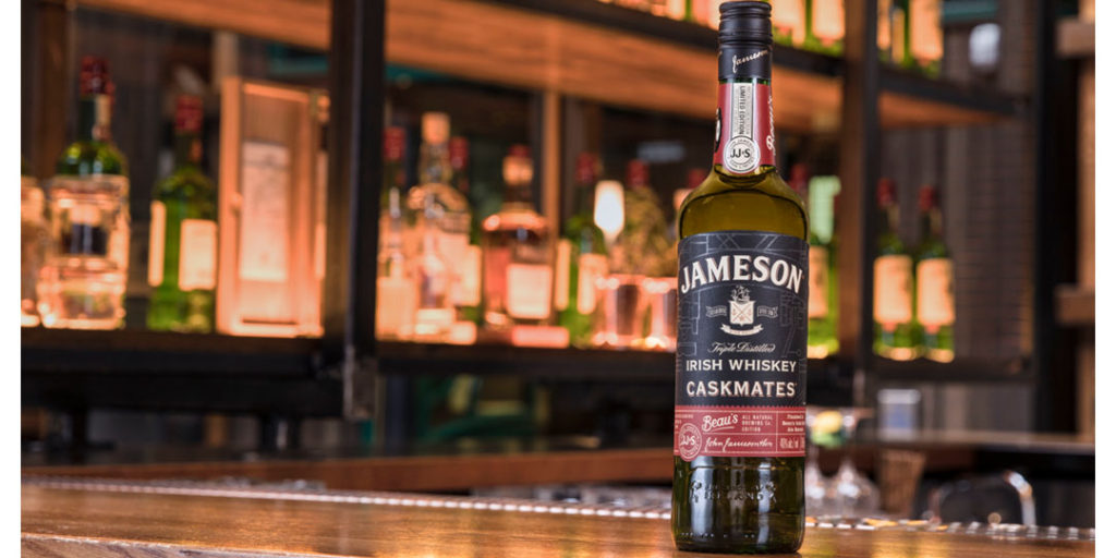
Jameson Whiskey has long had a friendship with Franciscan Well Brewery, a maker of stout beers that’s just a few miles down the road from their distillery. During a night out in 2013, an idea was formed—aging Franciscan Well’s imperial stout in Jameson Original barrels. The resulting creation was a success, a sweet and full-bodied beer with a nice whiskey finish. But as Franciscan Well was a small operation, they decided to flip their technique, and began aging Jameson in the stout beer barrels.
Served in dark bottles with labels designed to look aged or historical, the line was christened Caskmates. Like their other endeavours, it’s proven to be a success, and has been blended with other stout beers.
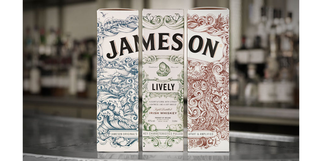
Jameson Whiskey Deconstructed Series
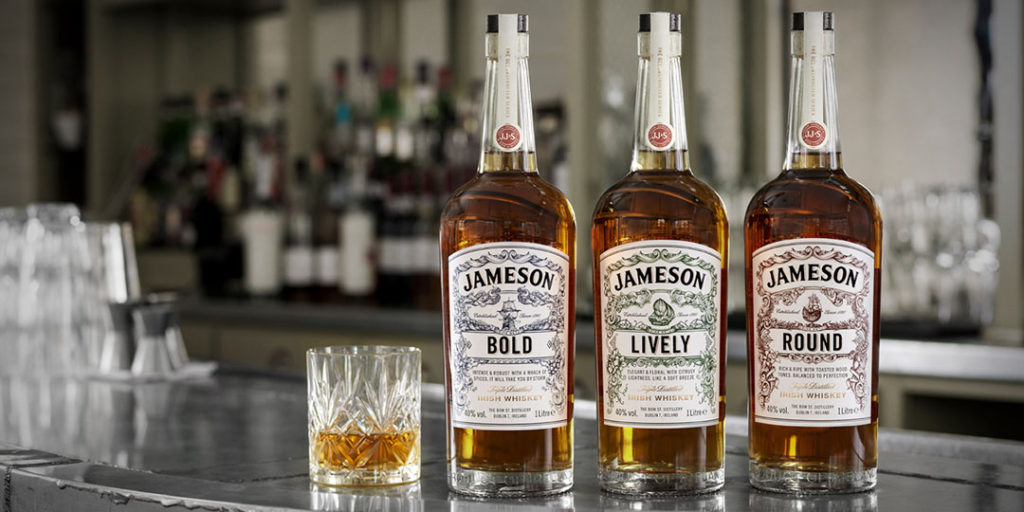
For the Deconstructed Series, each of Jameson Original’s components (Pot Still Whiskey, Grain Whiskey, Oak Contribution) is given its chance to shine. 3 distinctive whiskeys are created by dialing up one ingredient in each blend. BOLD is strong and intense, ROUND is well-balanced and smooth, and LIVELY is light and crisp on the tongue. Each bottle and its matching box takes on its own colours, iconography and personality, and once put together (or reconstructed, if you will), reveal and overall look and story they couldn’t tell on their own. You could say they form an artful packaging triptych.
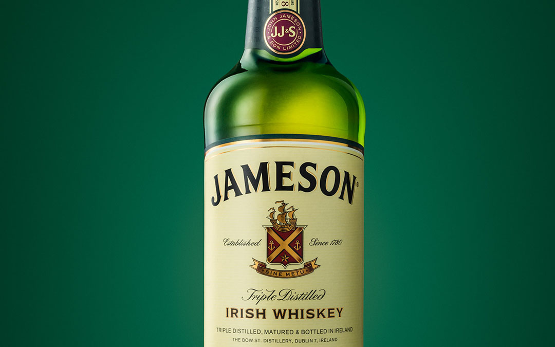
2019 Jameson Whiskey Bottle
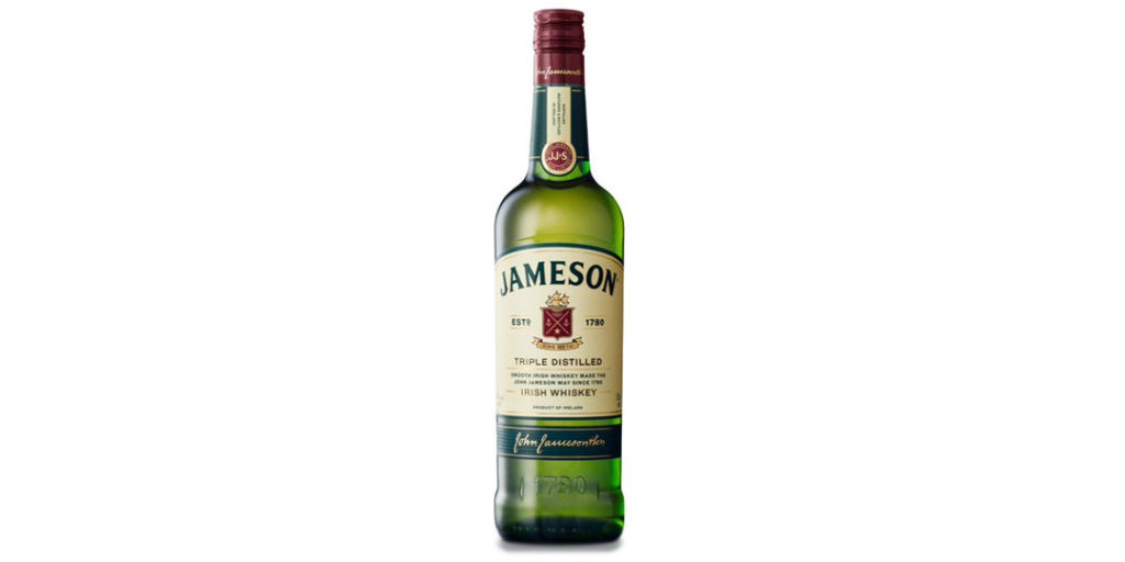
The main Jameson bottles have remained unchanged since 1968, retaining their green, cream and maroon colours as homages to the stained-glass door panels in the Bow Street Distillery building. Over 50 years later, and with Jameson served in more bars, pubs and private homes than ever, a refresh was in order. Not because the look was stale, but because there was an opportunity to make the bottle more tactile and even more enjoyable to hold.
The shoulder curve’s been rounded out, an embossed ‘eyebrow’ sits above the label, and the heel’s been made more pronounced. The long-standing green colour of the bottle and the classic look of the label have been kept. Jameson may be looking to the future, but it hasn’t forgotten where it came from.
It takes guts to play around with your brand and product line, and Jameson Whiskey has it in spades. The packaging and design choices made by Jameson have cultivated a brand that’s moved into iconic status, and we’re game to see what comes next. What brand’s packaging do you think is worthy of the iconic packaging mantle? We’d love to hear from you!