You know how they say don’t judge a book by its cover, and yet we tend to do it anyway? Well, we’re totally gonna do that today with beer bottle packaging. Though what’s inside the bottle is what everyone’s excited for, the outside is still the best way to catch the eye. Especially the eye of people who love packaging, like us!
We love colourful labels, smart designs, interesting printing techniques and especially any alterations to the bottle itself. That’s why this little collection we’ve assembled today has us so excited. Here’s 5 really good-looking examples of beer bottle packaging that we’re eager to get our hands on.
Mac’s Beer
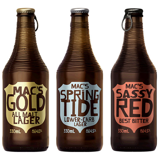
Hailing all the way from New Zealand, Mac’s has got some incredible personality. The spirited question of “What If?” guides not only their adventurous beer flavours (like an all-malt lager, a chocolate stout or a passion fruit IPA), but their branding too—their labeling includes an interstate sign shape, signifying their love of road trips and exploring anything they can. The unique ribbed bottle and unexpected rip cap are symbols of Mac’s pioneering attitude and the connection they feel to brewers of the past—sharing an adventurous, dedicated and boisterous spirit.
Jackeen Beer

This is a student spec project, and we love its style and ambition. Each beer, part of one line, has their own personality and the labeling to match. Hellfire’s sporting a pitchfork, Apache’s emblazoned with a totem pole, Quare Fellow’s carrying a smoking pipe, and Wise Guy’s armed with a Tommy Gun. Each one lets you know what you’re in for—something with bite, richness, smoothness or kick—all while tying into each other. As a fictional Dublin brewery, the hemp twine and cork stopper signify Jackeen’s classic roots, as if it just came out of a storage cellar.
Abadia Beer

Abadia was named after Spanish abbeys (Las Abadias). Strongholds of knowledge and safety during the Middle Ages, when such things weren’t in abundant supply, Abbeys were full of culture and reason. Abadia beer is meant to be both a stand out and a refuge among sub-par brews, and its current branding reflects its namesake. Not only is Abadia colourful, bright and full of light, its labeling also pays homage to the secretive nature of those abbeys. Fluorescent inks on the paper glow in the dark, like illuminated manuscripts carefully created by devoted monks and followers. It’s simple in design, yet steeped in meaning. What a concept, what a beer.
Heineken Beer

Here’s a beer we all know well. And here’s a packaging experiment that still stays true to its branding. An altered bottle shape immediately draws the eye, while the stark white keeps it there. The Heineken green adorns the bottle cap, and the logo itself takes up just enough space and no more. It’s simple, clean, new, and feels completely right. There’s not much else to say, except: Brilliant.
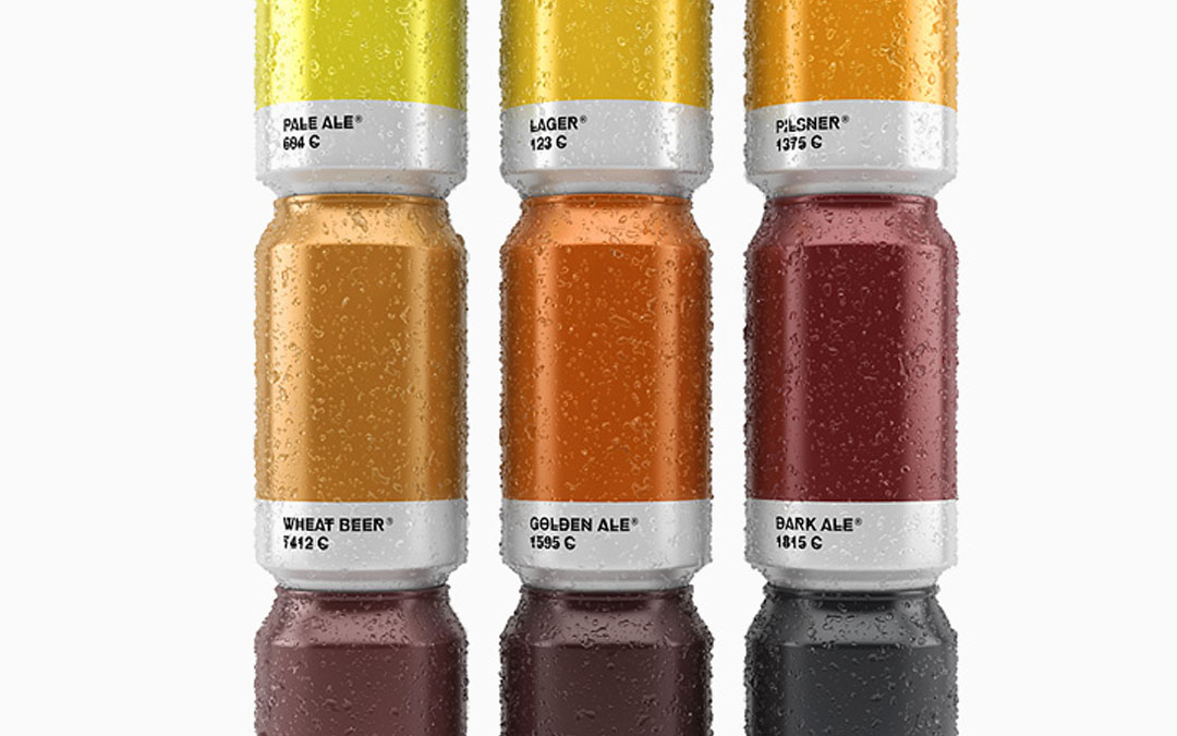
Pantone Beer

This, sadly, is just a concept. Who wouldn’t love to get their hands on Pantone beer bottle packaging? Or better yet, beertone! This is a designer’s dream, reducing packaging to its absolute minimal while still conveying everything about what’s inside. Plus, the rich colours and vibrant shine make these look amazingly attractive and undoubtedly delicious. Though, as lovers of design, we’re not sure if we could bring ourselves to open them.
Talk about good-looking beer bottle packaging, huh? If they look this good on a screen, imagine how good they’ll look and feel in person. You know us, we’re The Packaging Company, and we love packaging. Do you have any packaging that you particularly like? Be sure to share it with us on social media or in the comments below. We’d love to check it out!
Sources: Trending Packaging, The Dieline, Pinterest